Though I'd been satisfied with the look of Logic's notation for all the many years I've used it, only after installing Bravura did I realize what I was missing! With Bravura, notation takes on a much more professional, engraved look, and the difference between the stock Internal font and Bravura—both on-screen and in printed scores—is quite dramatic!
Installing Bravura
Let's begin with the entirely painless 3-step process of installing Bravura.
Step 1: Go to the Standard Music Font Layer website (SMuFL) at the following URL and download the font. It's free!
About halfway down the page you'll see a download button. And unless you've changed your file download location, a folder named bravura-1 will appear in your Downloads folder.
Step 2: Launch the Font Book app (standard on all Macs)
• Choose File > Add Fonts… or hit Command-O
• Select the bravura-1 folder itself.
The font is now installed and will become immediately available in Logic. Even if Logic was already up and running, there is no need to quit and re-launch it. All you have to do is select it, which brings us to the next and final step:
Step 3: In Logic…
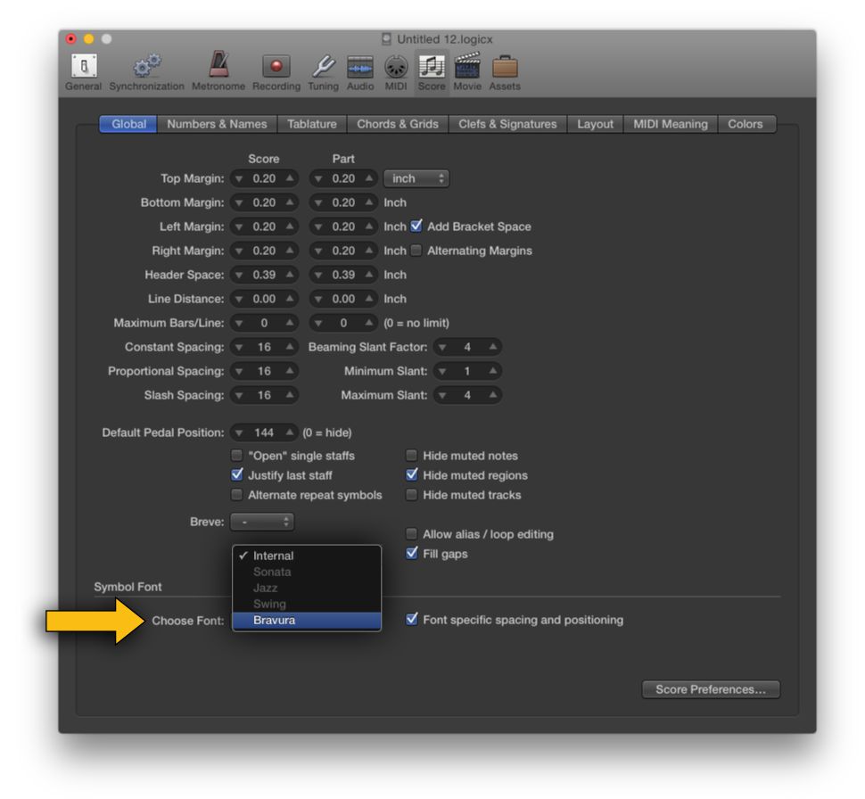
• Select the Score pane from within your current project's Project Settings
• Select the now-active Bravura font from the menu under Global > Symbol Font
That's all there is to it! See, I told you it would be easy!
Logic's Project Settings window, score pane.
Project by Project
You won't need to be concerned that installing this new font will affect the appearance of scores in previously saved projects. And that's because the choice of notation font (or Symbol Font as it's called in Logic-speak) is made—as shown above—in each project's Project Settings as opposed to Logic's main preference settings. In fact, you can freely switch between Logic's Internal font and Bravura to compare how it affects the appearance of your scores.
Now let's look at some of the differences and improvements the Bravura font offers, with side-by-side image comparisons.
Clefs, Signatures, and More!
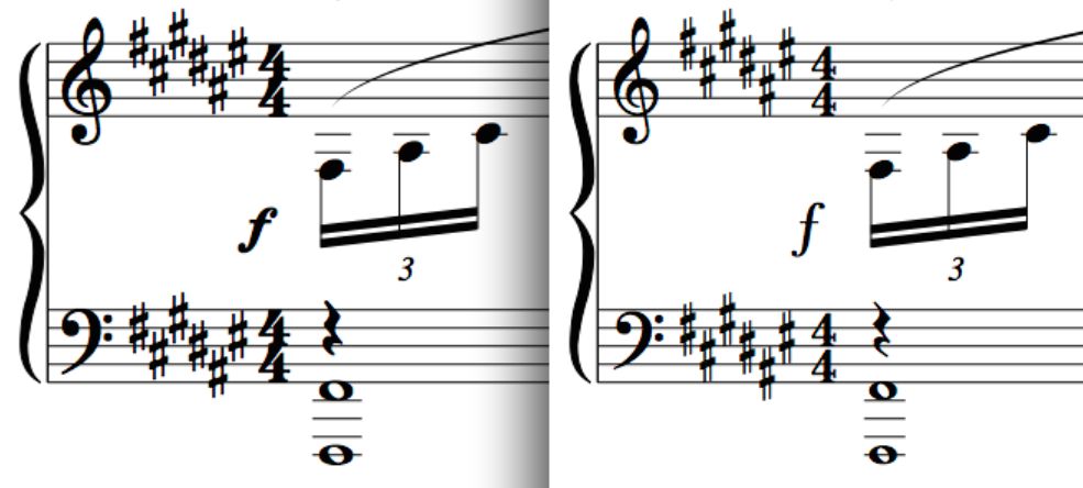
Figure 1 illustrates the same passage displayed with the Bravura font at left, Logic's stock Internal font at right. While the difference in appearance of the clefs is somewhat subtle, the same can't be said of key or time signatures. With Bravura, sharps are wider, bolder, and much easier to read. The same is true for time signatures, which simply look more “official”.
Figure 1: Bravura at left, Logic stock font at right.
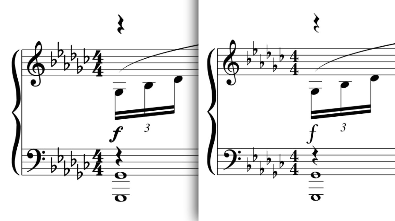
Another difference is evident in the forte dynamic marking. The thicker lettering, smaller size and acute slant are hallmarks of all Bravura dynamics. This makes them easier to fit onto the page when spacing is tight, as shown in Figure 2, where the staves were moved closer together to allow more systems to fit on the page.
Figure 2: Bravura at left, Logic stock font at right.
The comparison in Figure 2 also makes apparent the difference in shape and “airiness” of Bravura's flat symbols, as seen in the key signature of Gb major. Note also the larger and rounder shape of the whole notes, and the more “robust” look of the quarter rests.
Frilly or Frank?
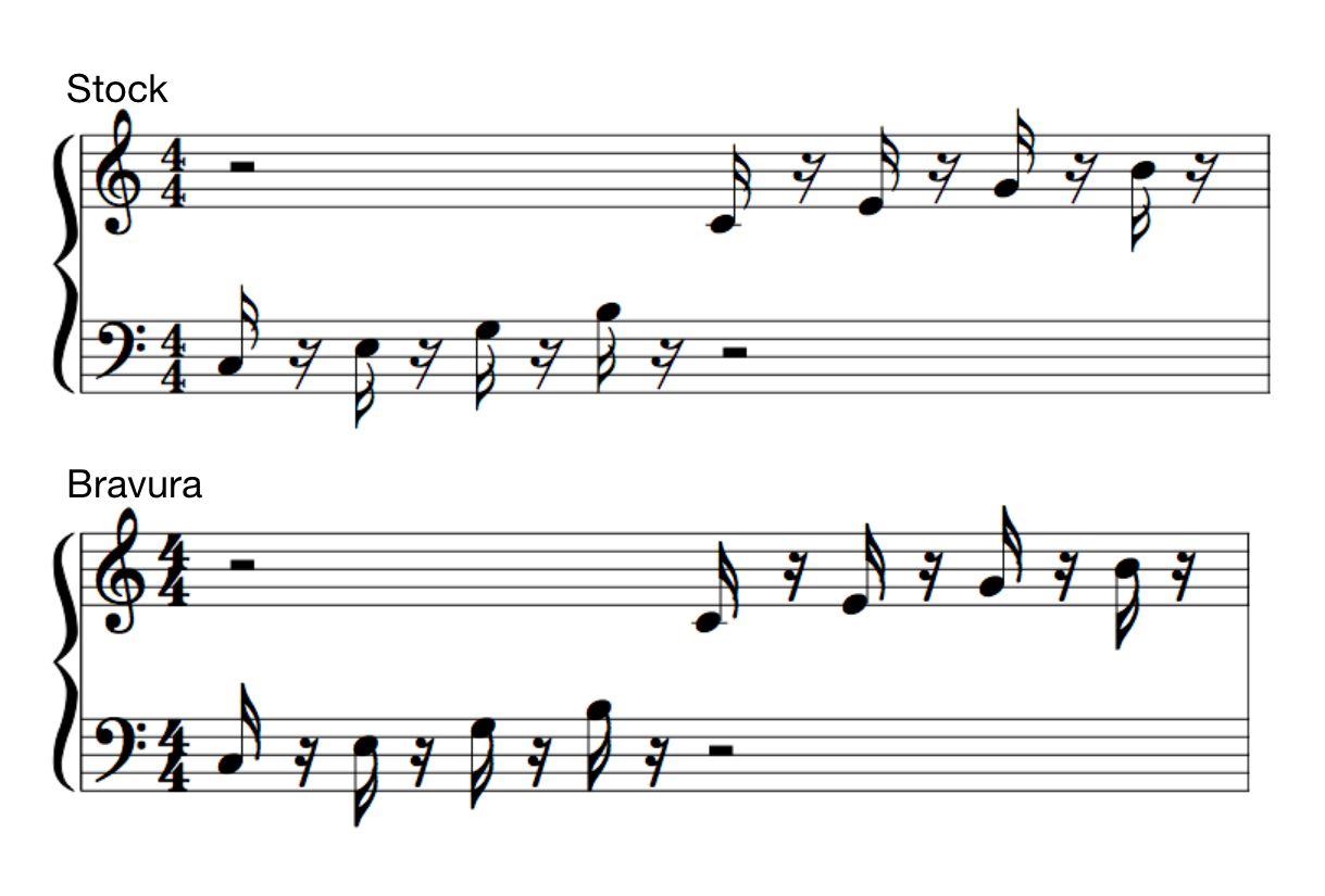
A striking difference in the way flagged notes are rendered is shown below in Figure 3. Logic's flags (top) are somewhat fancy and sport a distinct amount of overlap. Also, notice that the ends of the flags are clear of the note heads. By comparison, the Bravura's flags are thicker, don't overlap, and their overall straightforward appearance makes them easier to read.
However, depending on the pitch and the direction of the stems of flagged notes—including eighth notes—the tips of the flags will sometimes connect with the note heads. This can be seen in all of the down-stemmed notes in this part.
Figure 3: Bravura's flags will sometimes connect with the note heads.
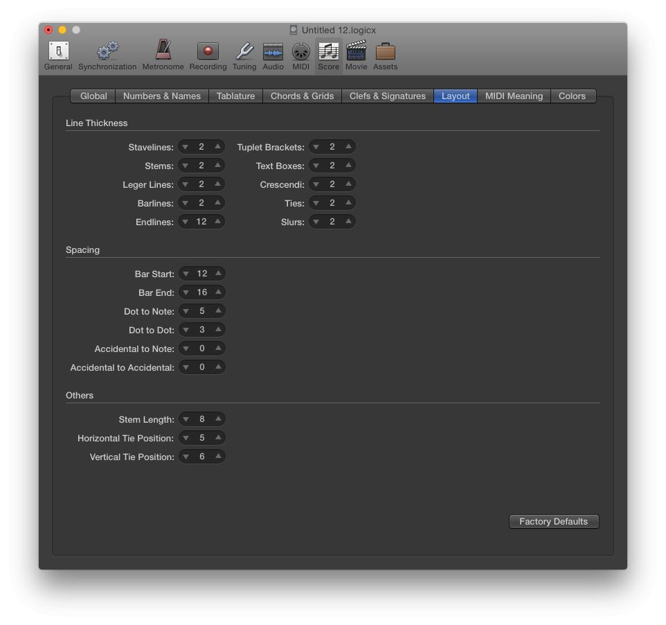
Personally I find that disconcerting, but fortunately there's an easy fix. The “Others” section of the Score Project Setting provides an adjustment for Stem Length. Normally this value is set to 7, but bumping it up by one to a value of 8 makes a dramatic improvement (see Figures 4 and 5).
Figure 4: Bravura font, a simple adjustment to the Stem Length parameter clears space between the tips of flags and note heads in down-stemmed notes.
Figure 5: The Layout tab of Project Settings > Score.
While adjusting this parameter will globally extend the length for all stemmed notes, it will have only minimal impact on the appearance of quarters or halves while producing a marked improvement in the appearance of down-stemmed flagged notes.
And as is the case for font selection, the Layout Parameters—and any adjustments you make to them—will be specific to each project.
Specifically Symbols
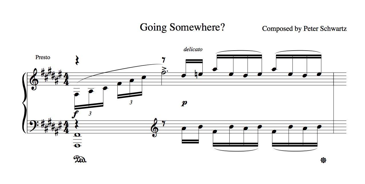
The Bravura font is quite specific to providing an alternate way of displaying score symbols, including note heads. But is has no influence on the appearance of text. With the exception of dynamic markings such as the forte and piano symbols shown in the illustrations above and below, selecting the Bravura font for a project will not influence normal text such as performer instructions, title, or composer's credit. The font attributes of text items, including lyrics, are determined (as usual) by Logic's Text Styles.
Figure 6: Typical text, including performance instructions, title and credits, are not affected by selecting the Bravura font.
An Easy Conclusion
I'd like to recommend—without hesitation—that any avid user of Logic's score editor install the Bravura font and put it through its paces! It's free, it's painless to install, and a sure-fire way to improve the readability and overall professional appearance of Logic's notation output, whether on-screen or in printed scores.




 © 2024 Ask.Audio
A NonLinear Educating Company
Discussion
Title/Author = either (boring) Times or (casual) Inkpen
Chord Symbols & Multi-Rests = the defaults
I've gotten into the habit of inserting Date and Song items from the "A" partbox item, especially during the draft stages, to keep track of different versions when I print out music. For these I use a custom boxed text style so that they stand out on the page. This same boxed text style is also useful for rehearsal letters, as well as to highlight instrument change instructions.
Want to join the discussion?
Create an account or login to get started!