
I love Styles in InDesign. If you’re not using them, you’re working too hard, and missing out on the most powerful features in the program. The days of manually changing the size of each heading one by one are well and truly behind us — or should be. We’ll focus on text styles today, and there’s a lot of detail to explore. Let’s dig in.
Repetition

Body text all the same, headings all the same — consistent and easy to understand.
A cornerstone of design that I’ve discussed in my recent video training course, repetition encourages you to repeat the same styles, colors and motifs throughout a publication. If you change everything on each page, you’ll be making your readers work too hard to understand your document, and making your job much more difficult.
Styles allow a designer to define how every kind of heading, body text, sidebar and bullet should look, and can even help non-designers produce great-looking work. The most important place you should be using styles is with text, and the most important text style is a Paragraph Style. Once you’ve made a style, all you need to do is select some part of a paragraph you want to affect, then click on the style name to apply it.
Setting up a new Paragraph Style

Create a new Paragraph Style with one of these two options
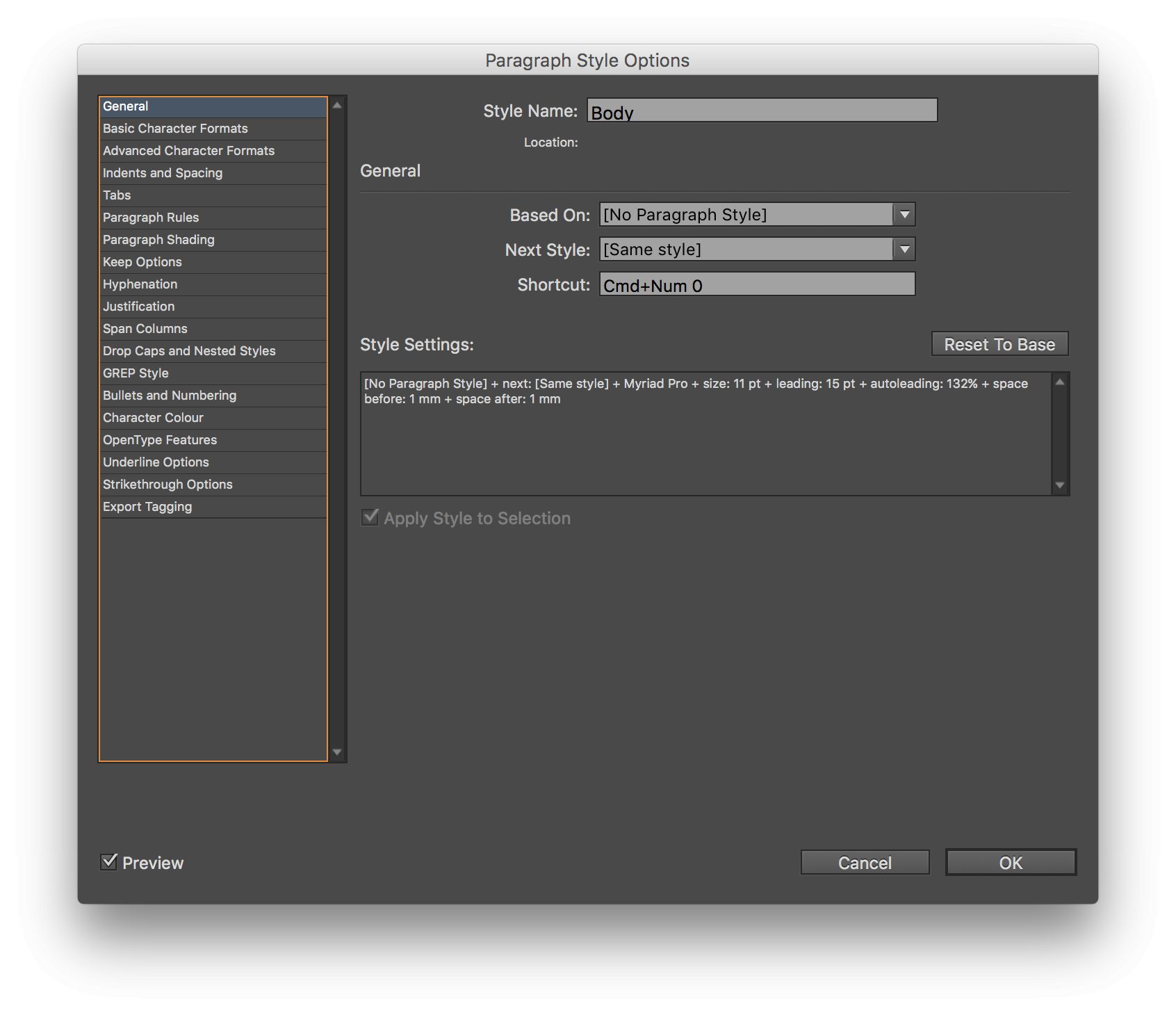
Head to the Window menu, then choose Styles > Paragraph Styles so you can see the panel. (Choosing Advanced from the Workspace menu is another good way to show it.) Create a new document, then a text box, and fill it by choosing Type > Fill with Placeholder Text. Select all the text, then create a new Paragraph Style by choosing New Paragraph Style from the panel menu, or Option-clicking the “New” button at the bottom of the panel. These options create AND edit a style, which is what you want.
The dialog that appears lets you do an awful lot. Down the left-hand side, you can choose from many categories, each of which lets you define how the text should be displayed. On this first screen, you can give this style a name (“Body”) based on “No Paragraph Style”, for which the Next Style will be the “Same style”. If you have a numeric keypad, click in the Shortcut field, then type a new shortcut: Command, Command-Option, Command-Shift or Command-Option-Shift and a number pad key. The numbers above the regular keyboard (maddeningly) cannot be used for Style shortcuts, but if you don’t have a number pad, you can use the free Karabiner app to emulate one. A lifesaver on laptops.
While you’re here, check “Apply Style to Selection” and (in the bottom left corner) check Preview. As you’re exploring, uncheck “Add to CC Library”.
Exploring Paragraph Styles
Each section on the left is useful for specific things, and they’re all worth exploring. In brief:
General is the first page we’ve been looking at, and is important. Check the Summary here to troubleshoot any problems.
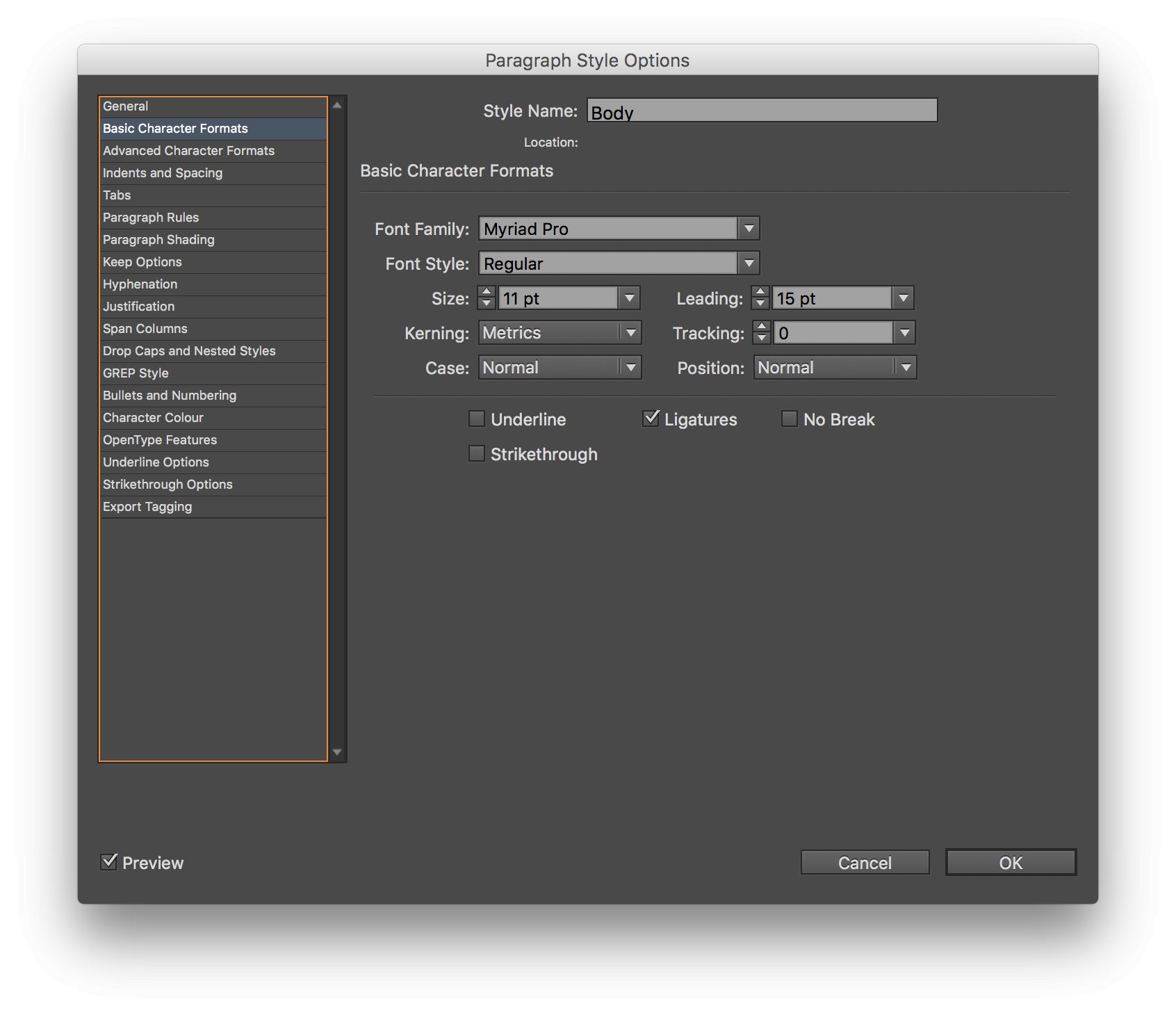
Basic Character Formats defines font family, style, size, leading, kerning, tracking, case, position, and a few other items. Try Myriad Pro @ 11pt with 15pt leading.
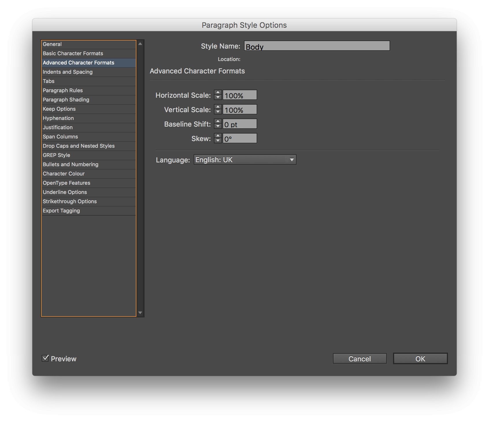
Advanced Character Formats should mostly be avoided, but the language is also set here.
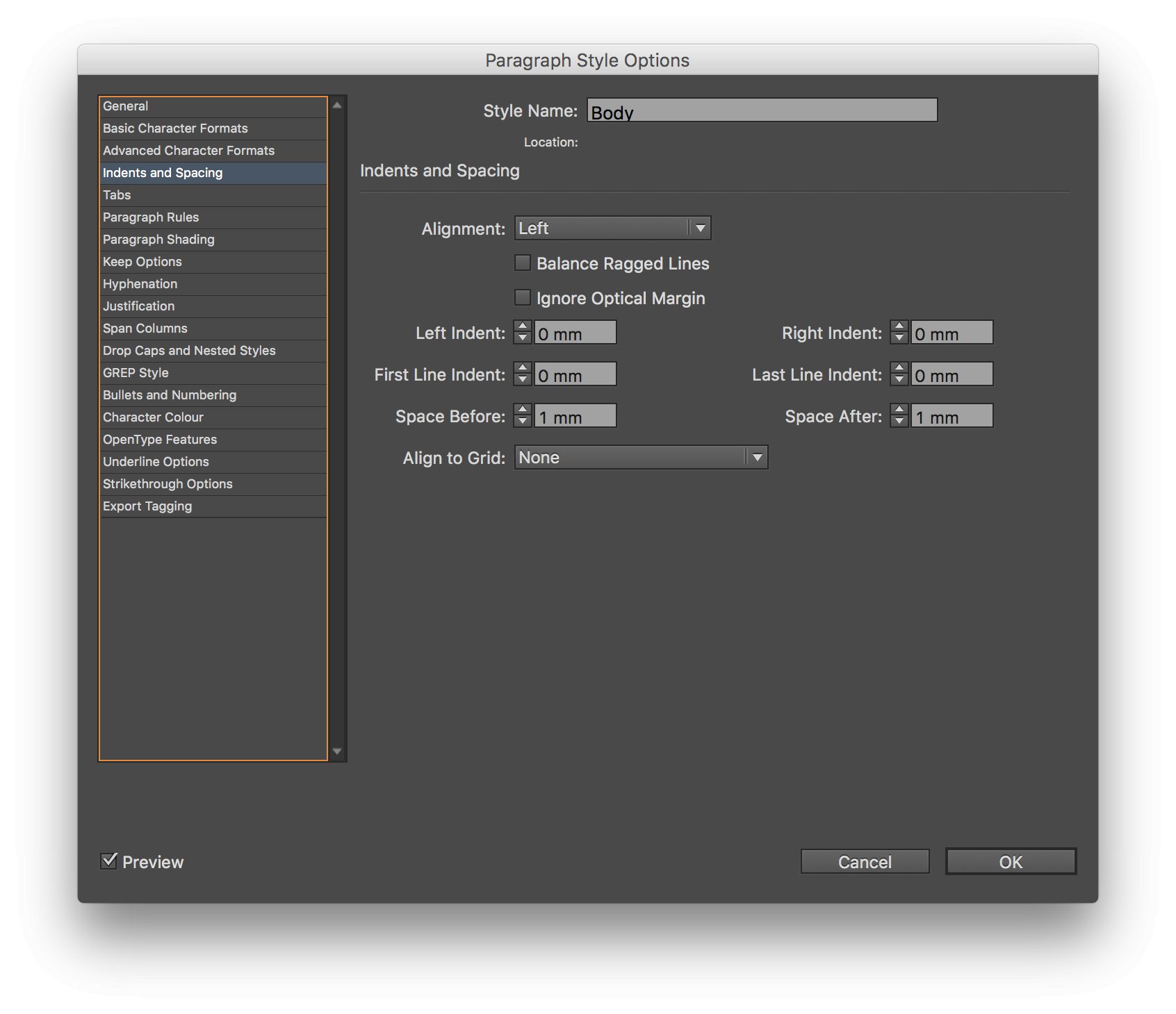
Indents and Spacing governs alignment, the Balance Ragged Lines option, indents, first line indents, and (crucially) the Space Before and Space After paragraphs, so you never need to hit Return twice. Grid alignment is also here.
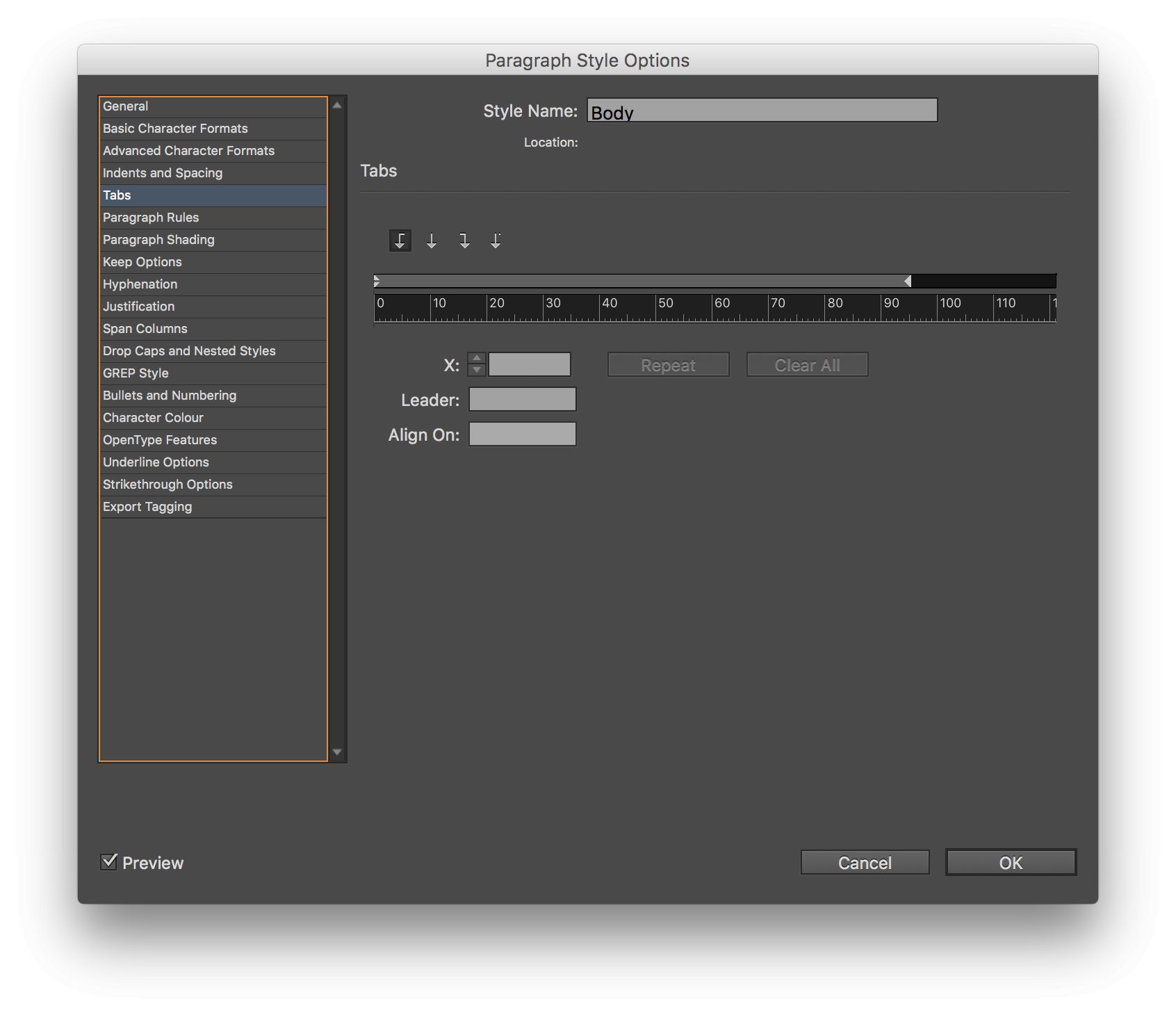
Tabs is self explanatory, and is handy for Tables of Contents.
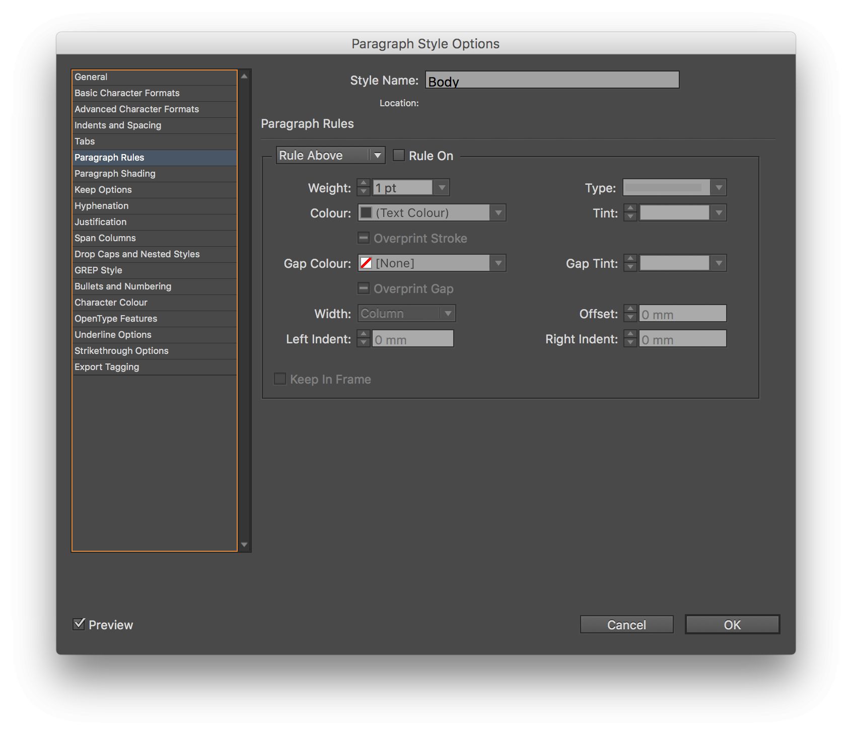
Paragraph Rules lets you add lines above or below a style, useful for headings and for callout quotes.
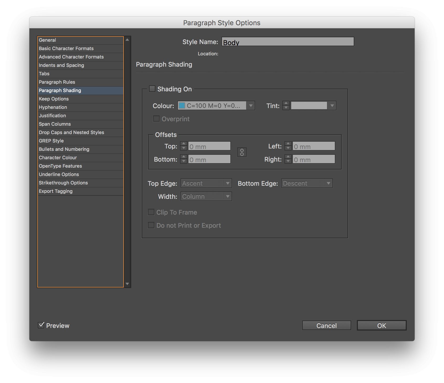
Paragraph Shading lets you add a background color to a paragraph.
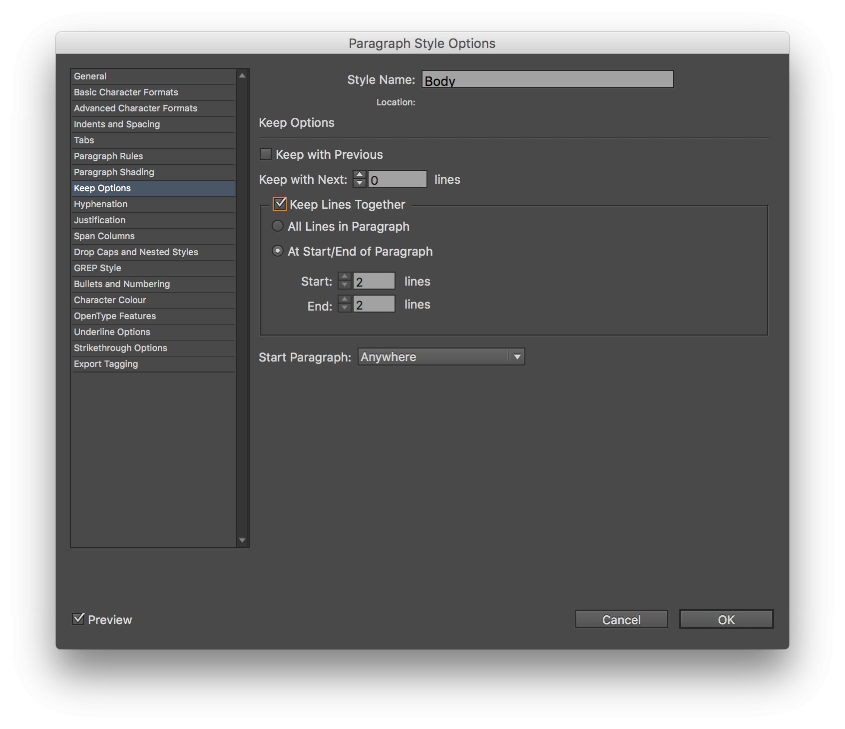
Keep Options lets you glue a paragraph’s first two and last two lines together, to prevent widows and orphans. You can also glue a heading to the paragraph that comes after it, or force a heading to start on a new page — very handy stuff. For now, tick the Keep Lines Together option and leave the other options at default settings.
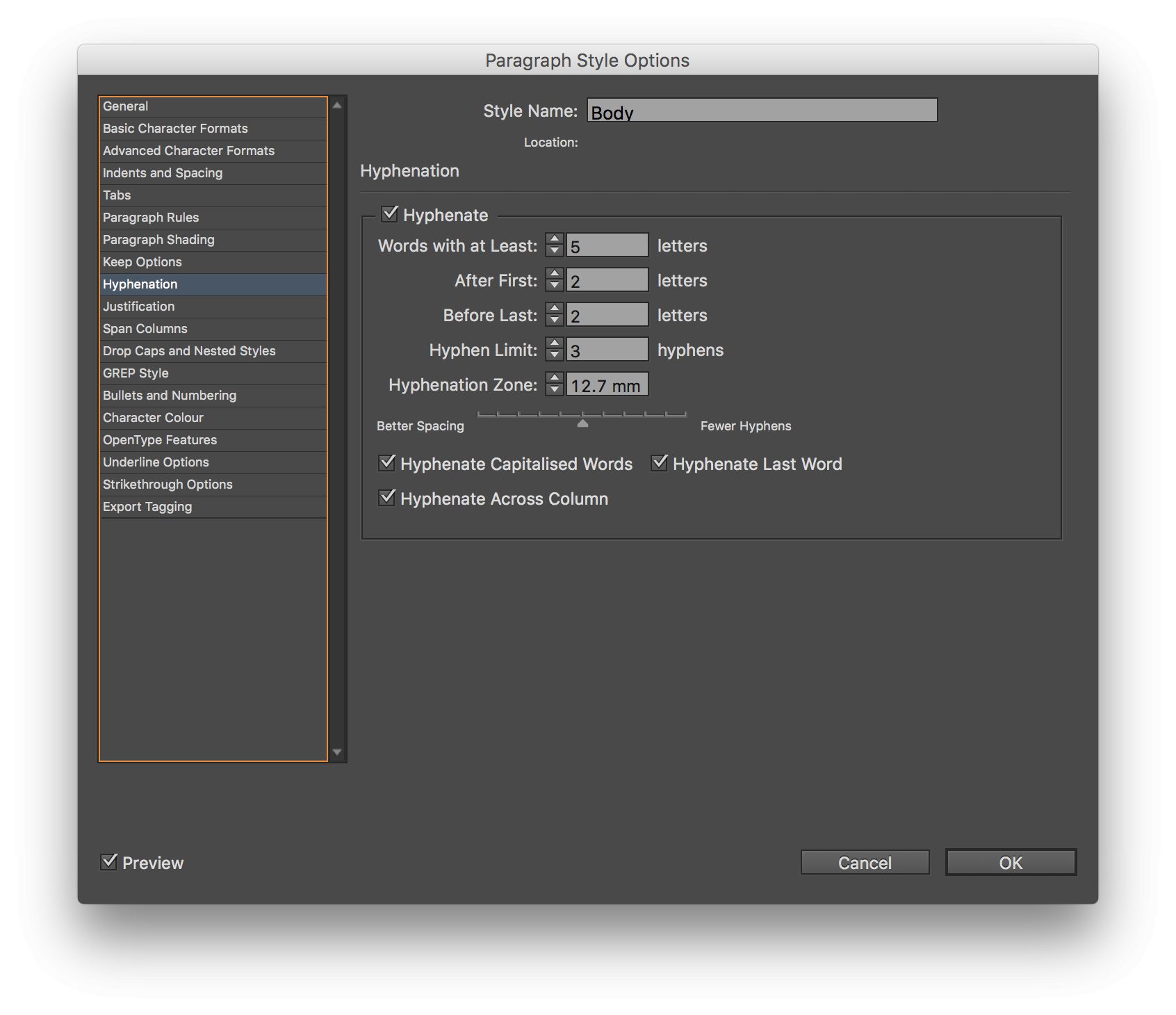
Hyphenation lets you tweak the finer points of hyphenated text, or simply turn it off.
Justification lets you change how justified text looks, though the default settings won’t do it any favors. If you’re a fan of justified text, leave Hyphenation on, and try -5, 0, 5 for Letter Spacing and 98%, 100%, 102% for Glyph Scaling. Oddly, Auto Leading is here, which has nothing to with Justification. If you want to use Auto leading, change this to 132% to let your body text breathe a little.

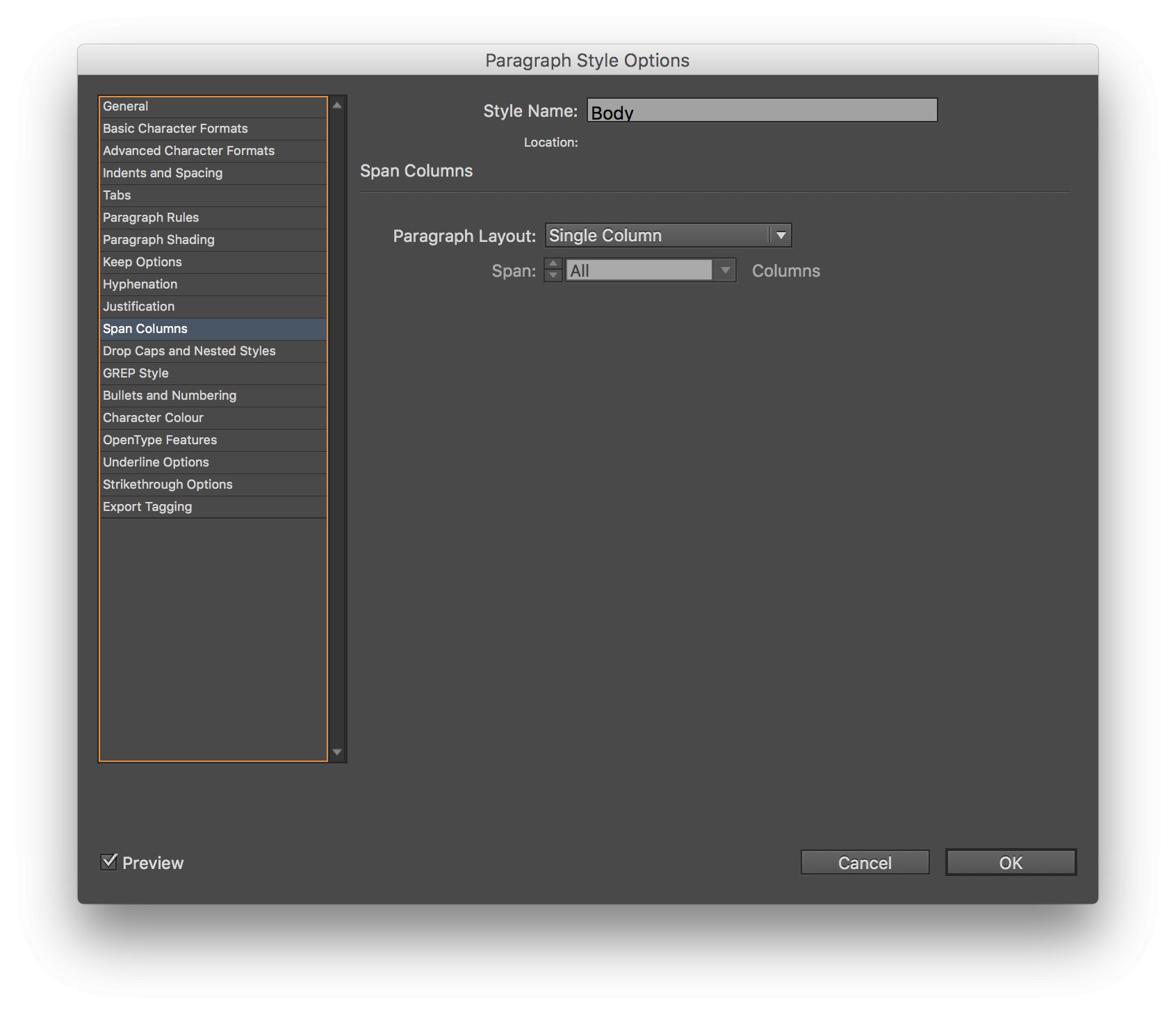
Span Columns lets a heading cover more than one column in a multi-column text box, though if you’re feeling brave, it can also be used to create multiple columns in a single-column text box.
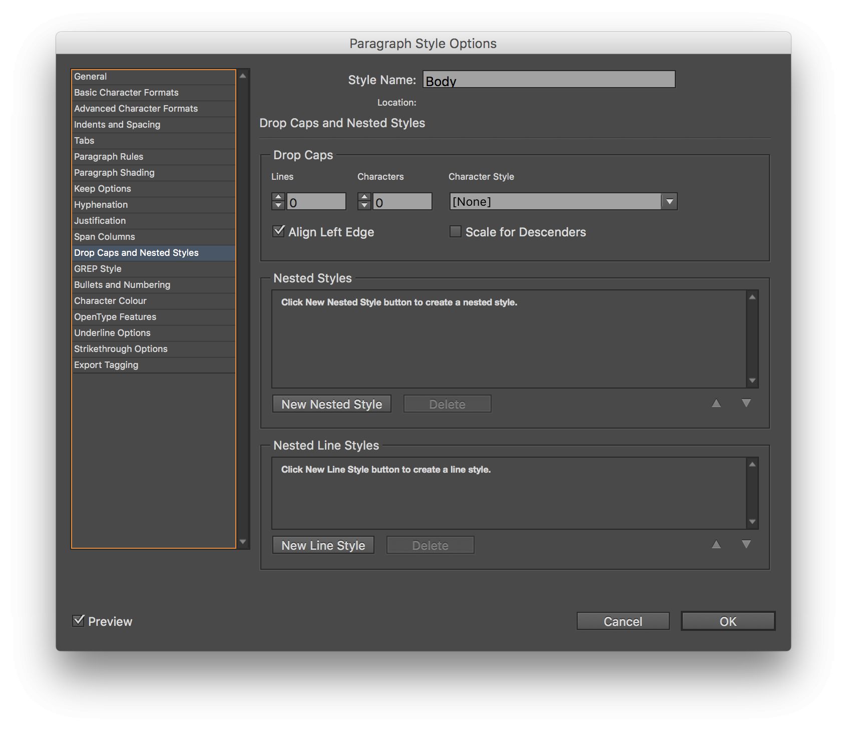
Drop Caps and Nested Styles lets you create storybook-style large initial caps, but can also be used to apply a Character Style to a specified number of words or lines. If you define a Character Style to set bold and all caps, you could use this to automatically force the first line of an article to use that Character Style.
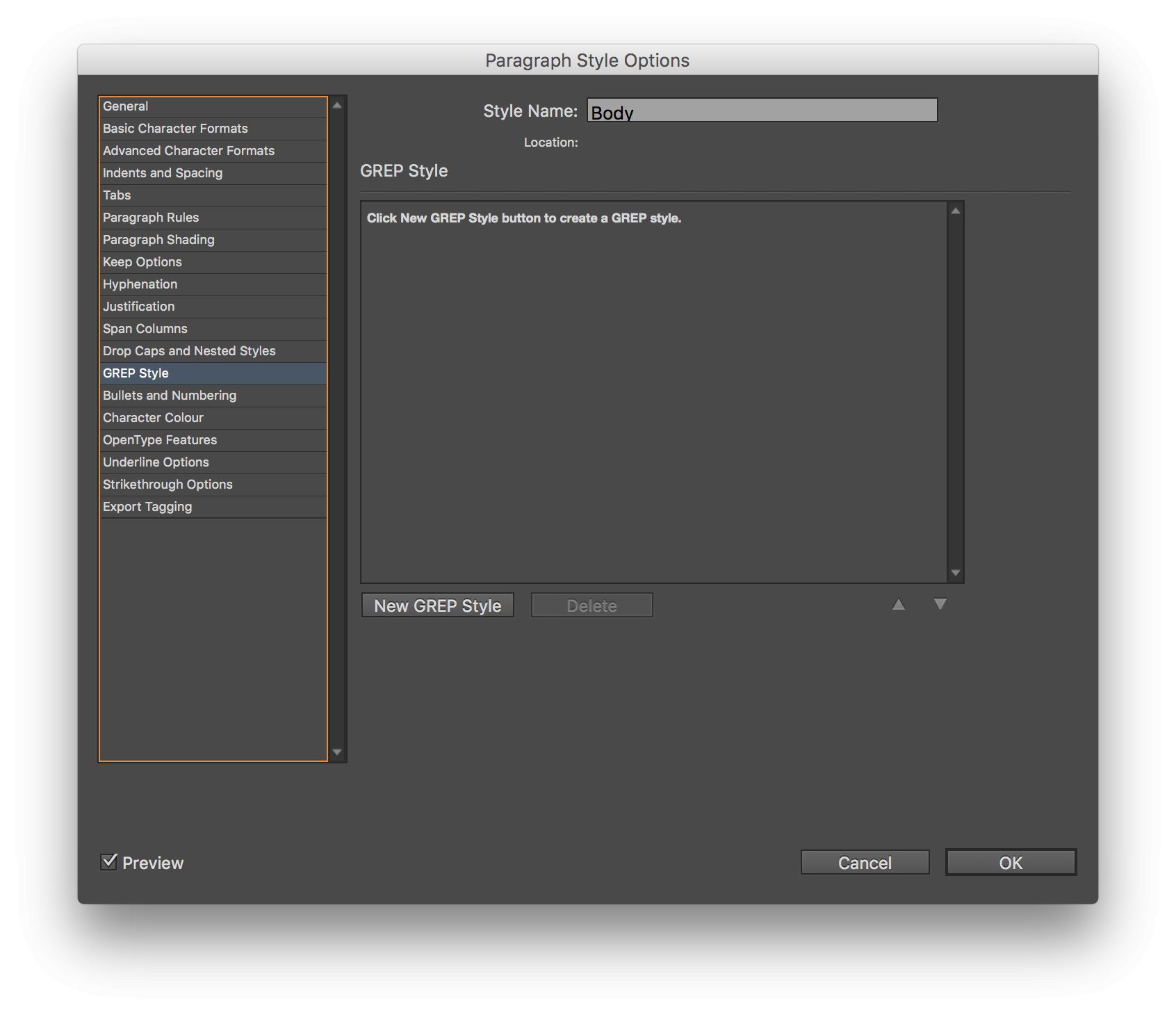
Grep Style gives you Awesome Nerd Powers™. We’ve looked at these before.
Bullets and Numbering lets you define the type of list, the character you use for bullets, the style the bullet uses, and its position. You’ll need a few bullet styles for complex documents.

Character Color, OpenType Features, Underline Options and Strikethrough Options all do what you’d expect, but most users won’t need to mess with these.
Export Tagging could be spectacular for specific web-output workflows, as you can define which tags and classes are used for this style, and even see the CSS that’s going to be produced.
Using a Paragraph Style
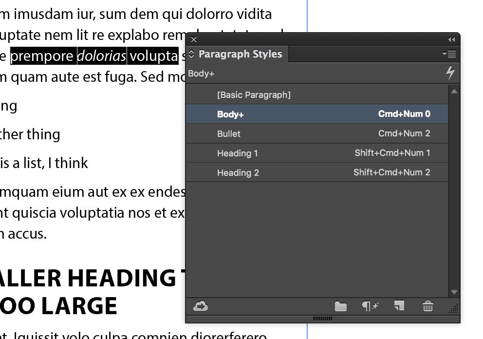
When selecting text, you can be messy — Paragraph Styles always apply to entire paragraphs automatically. Select all or part of the text you want to affect, then press the style’s shortcut key, or select the style from the Paragraph Styles panel.
This italic hasn’t been set up as a Character Style, so it’s an override
Clearing Overrides
Sometimes, manual changes can stick, even though a style has been applied, and InDesign will show you this with a “+” after a style name, to indicate that Overrides have been applied. To clear out these extra styles (bold, italic, superscript and so on) just Option-click on the style name, or click the “Clear Overrides” button in the Paragraph Styles panel.
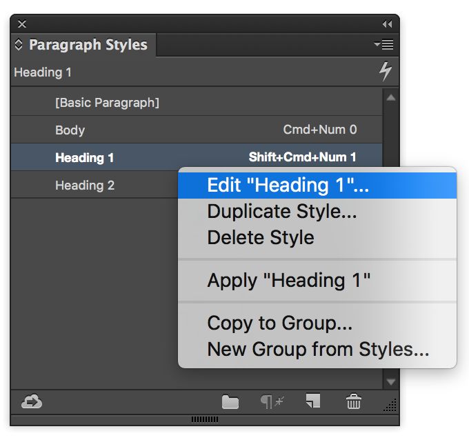
To avoid accidentally changing your default settings, always right-click on a style name to edit it
Editing a Paragraph Style
To make a style change, right-click on that style’s name in the Paragraph Styles panel, edit it, then press OK. Every instance of that style will be updated throughout the document. If you’ve selected an instance of the style you want to change, you can also double-click the style name to edit it, but right-clicking is safer, more reliable, and the habit to get into.
Redefining a Paragraph Style
If you’ve made manual changes to a paragraph’s look and want those overrides to become the new style, that’s easy. Right-click on the style name and choose Redefine Style. The new look takes over from the old, and all instances of the style are updated.
Just a few words at a time — Character Styles

When should you use Character Styles?
They’re just like Paragraph Styles, except that all the paragraph-level options are missing. Use Paragraph Styles first, and Character Styles when you need to affect just a few characters or words. If possible, use GREP Styles, Nested Styles or Nested Line Styles to apply Character Styles automatically.

A few styles in the Paragraph Styles panel
A few recipes
Just as a brief starting point, you could pick your favorite font and make these styles:
- Body: Size/Leading 11/15pt, Regular, Space Before/After 1/1mm, Keep Lines Together 2/2
- Bullet: Based on Body, First Line Indent 10mm, Left Indent -5mm
- Heading 1: Based on Body, Next Style Body, All Caps, Size/Leading 30/32pt, Bold, Space Before/After 6/2mm, Keep With Next 1 Line
- Heading 2: Based on Heading 1, Size/Leading 18/20pt, All Caps, Space Before/After 4/1mm
Now take a heap of text and see how long it takes to format it. Quick, right? Now right-click on Heading 1 and change its colour, and watch the magic cascade through all the headings.

Most of this is plain Paragraph Styles, but a few spots of red have been added with Character Styles
Conclusion
Applying a style is easy, changing your mind later is easy, and producing a table of contents is easy too — it’s automatic, and based on the Paragraph Styles you’ve applied. There really is no downside, and if you haven’t used Styles before, it’s time now. Enjoy!

Discussion
Want to join the discussion?
Create an account or login to get started!